Project
Redbridge campaign & identity
Year
2019–2019
Client
Redbridge Living Ltd
Local authority
London Borough of Redbridge
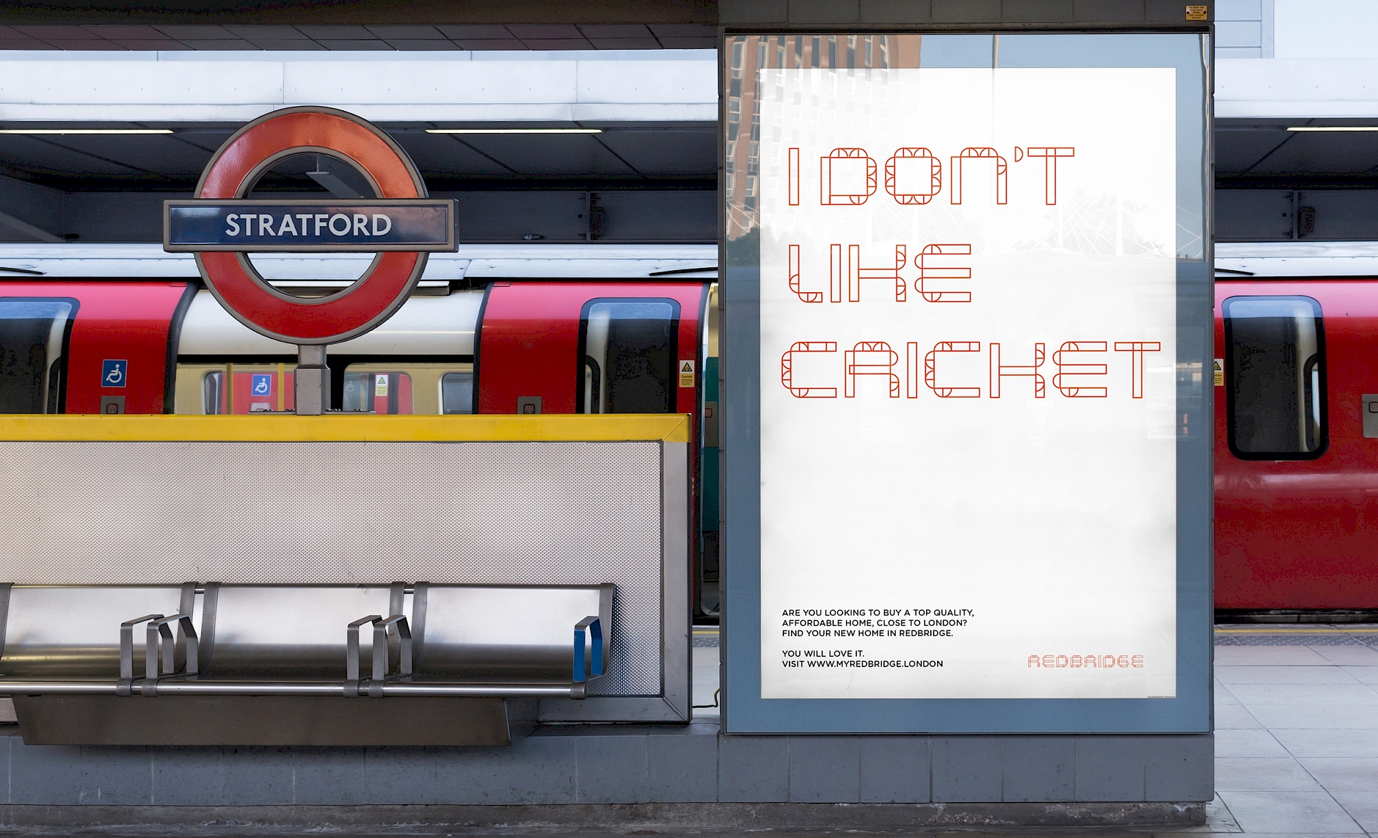
PTE was asked by the London Borough of Redbridge to create an overarching engagement communications strategy for two residential developments – Loxford Lane and Seven Kings. Though the sites are linked and were to be promoted with the same look and feel, each has its own vision and typology. The challenge of the brief was therefore to reflect the bespoke architectural response on each site, and at the same time tie them together graphically.
Redbridge, named after a red brick bridge which crossed the River Roding and was demolished in 1922, inspired the concept of a bridge between words and shapes. We created a font constructed with references to the bridge shape and used this to brand the developments. Each site then had its own separate graphic system while sharing an overarching creative idea.

Initially a communications strategy including a logo, flyers and consultation boards, the project developed to include a comprehensive proposal for the visual identity and advertising of the Redbridge sites.